10 of the Best Landing Page Design for Better Conversions
Ever landed on a page and felt instantly hooked or instantly turned off? That’s what a landing page design can do. A good design can make your business, while a bad one can surely mar it in the same manner. In 2025, attention spans are shorter, competition is tougher, and user expectations are higher than ever. So, how exactly do you stand out amidst all these?
Good question! To get a web landing page design that converts your audience is more than just pretty visuals, it’s about clarity, speed, trust, and that little spark that makes people take the desired action.
At Roareye, we don’t just design, we design for results. With creative design and strategy, we create landing pages that establish your brand online. This guide covers the latest best landing page designs, creative trends, real landing page design examples, and best practices for landing page design that you can use to inspire your next project.
Why Some Landing Page Designs Convert Better Than Others
Ever walked into a store and just felt like you were in the right place? That’s exactly what you want your landing page designs to feel like. Make the best impression in the first few seconds.
So, before going into creating those layouts, just relax and understand how best to make that impression. The best landing page designs differ from others for a reason because they are welcoming, clear, flow smoothly, and are designed with the user in mind.
Core Principles of Creative Landing Page Design: Branding, Layout & Clarity
A good landing page design should scream (politely): “Here’s what we do and why you need it right now.” That means a clear hero section, clean typography, good visuals, and a clear CTA.
Creative landing page design also adds the brand identity through consistent color schemes, logos, and voice. When design aligns with message being passed, users are more likely to trust your business and take action.
At Roareye, we combine branding and clarity so users instantly get your value and feel confident about taking an action.
Performance and User Experience Tips for Web Landing Page Design
Is a website taking too long to load? I’m off in seconds. I’m sure it’s the same for you as well. Even the best of web landing page designs will fail if it frustrates users. That’s why performance and user experience must go hand in hand.
Here are a few tips to improve landing page performance:
- Compress images without losing quality.
- Use lazy loading for media-heavy content.
- Keep scripts lightweight to avoid slowdowns.
- Prioritize mobile-first responsive layouts.
For every second your landing page is slow, you lose more customers to your competitors. Looking for a landing page that outperforms your competitors in both design, conversion and performance? Come onboard with Roareye, and let’s get you a well-optimised landing page with just the right strategy.
10 Inspiring Landing Page Design Examples
Sometimes the easiest way to understand what works is to see it in action. Let’s take a look at some inspiring landing page design examples that really works. Each example shows a different style, but they all know exactly how to guide users toward taking a desired action.
Jasper AI: SaaS Landing Page Design
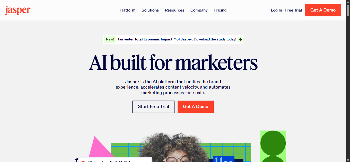
Source: Jasper
AI writing can feel complicated, but Jasper’s landing page makes it feel simple. The design is clean, the promise is clear, and the sticky CTA follows you as you scroll—so you’re never far from taking action.
What’s awesome about this landing page design:
- Sticky CTA button: No matter how much you scroll, the red “Get a Demo” button is always within reach.
- Real use cases: Jasper showcases how marketers, writers, and teams actually use the product.
- Trust elements: Client logos and testimonials reinforce that the tool works for real businesses.
Miro: SaaS Collaboration Landing Page Design
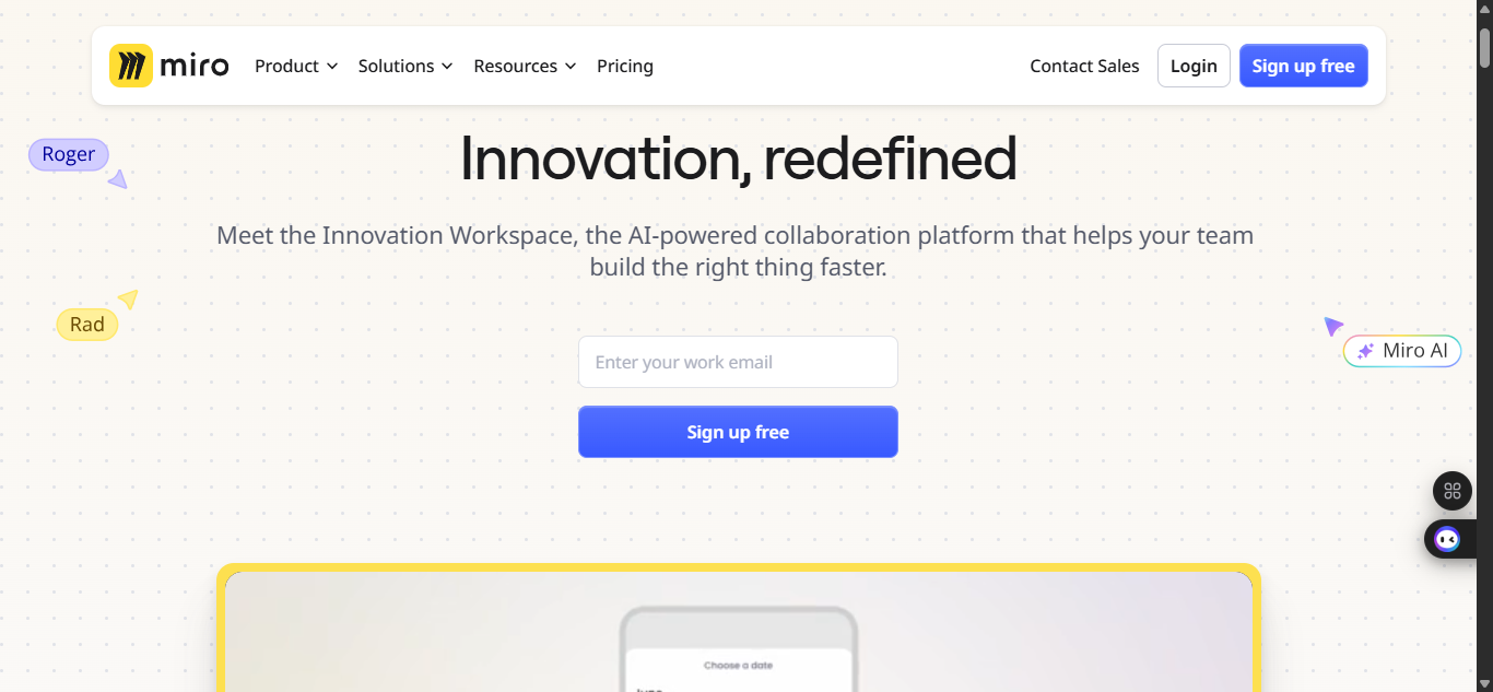
Miro’s biggest challenge is explaining what a digital whiteboard actually does. Their landing page solves this with a short demo video and simple copy that focuses on teamwork, not tech jargon.
What’s awesome about this landing page design:
- Video explainer upfront: Visitors instantly see how Miro works.
- Simple CTAs: Phrases like “Start a board” feel friendly and accessible.
- Proof through scale: Stats like “60M+ users” build confidence.
Airbnb: Service Landing Page Design
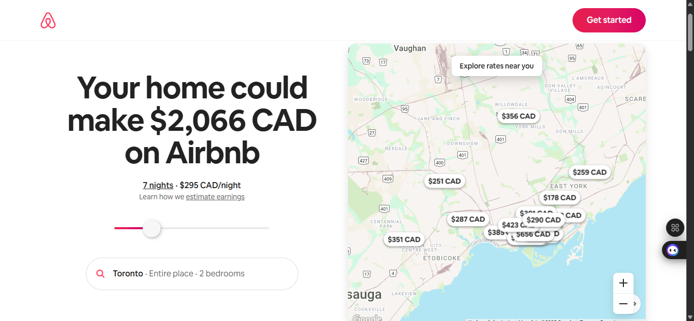
Source: Airbnb
For Airbnb’s host sign-up page, the goal is simple: get more people to list their space. The landing page keeps things frictionless by starting with just one field—your address—so you can see potential earnings right away.
What’s awesome about this landing page design:
- Low-barrier entry: Users only type in their address to start.
- Personalized incentive: The page shows how much you could earn in your city.
- Safety reassurance: Clear messaging around secure payments and guest verification.
Shopify: eCommerce Landing Page Design
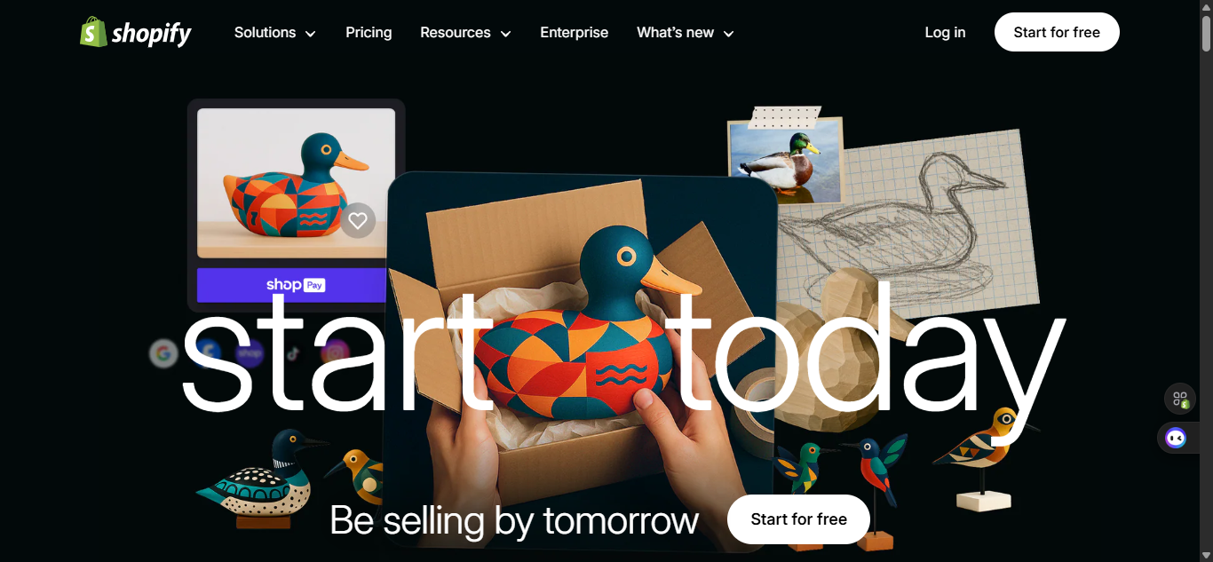
Source: Shopify
Shopify’s trial landing page focuses on one thing: getting people to start building their online store. The Hero section shows a video of the process of bringing a creation to live. The copy “Start today, be selling by tomorrow” is also motivating, and it shows just how easy and fast, building a store on Shopify can be.
What’s awesome about this landing page design:
- “Start for free” CTA upfront: No payment required, lowering hesitation.
- Social proof: Big-name brands using Shopify appear above the fold.
- Minimal form: Only asks for an email, which makes getting started effortless.
Netflix: Subscription Service Landing Page Design
Netflix’s landing page is a masterclass in simplicity. With one bold headline, a short explainer, and a single sign-up field, it removes every barrier to entry.
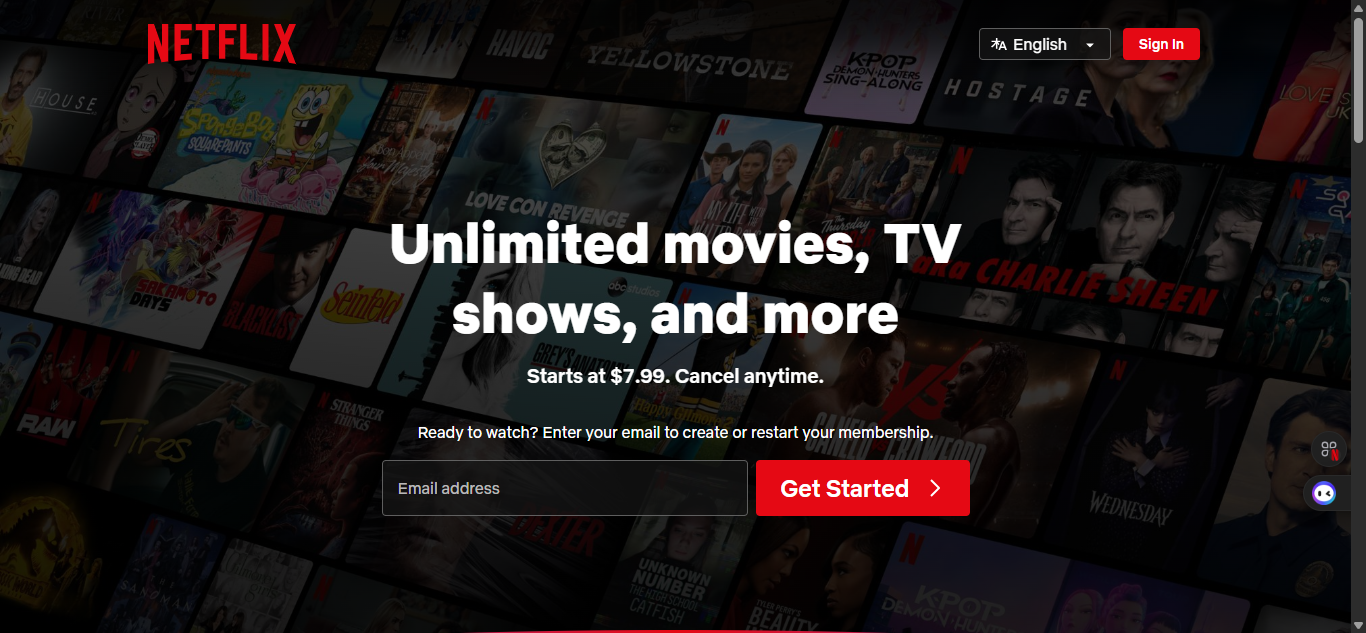
Source: Netflix
What’s awesome about this landing page design:
- Clear single action: Just enter your email and you’re in.
- Bold promise: “Unlimited movies, TV shows, and more.”
- Transparency: Pricing and cancellation details are visible upfront.
HubSpot: Lead Generation Landing Page Design
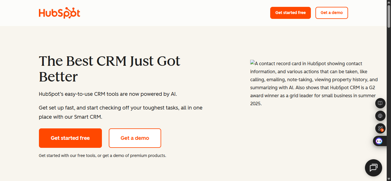
Source: Hubspot
HubSpot’s lead-gen landing pages are built on trust. They don’t just ask for your contact info, they give you free tools, templates, or guides that are actually useful.
What’s awesome about this landing page design:
- Value-first: Free resources build goodwill before the ask.
- Clean forms: Simple layouts with minimal fields.
- Authority cues: HubSpot leans on its reputation and brand recognition.
Slack: SaaS Service Landing Page Design
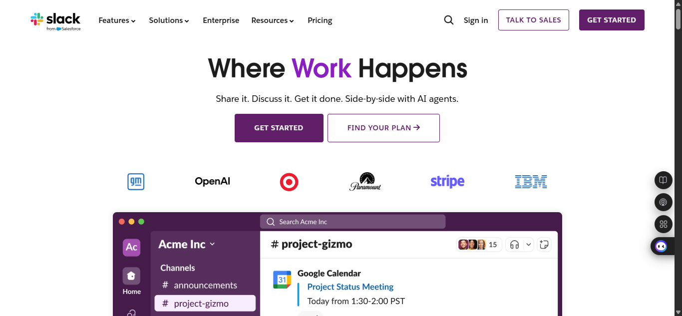
Source: Slack
Slack’s landing page design speaks directly to teams who want better communication. The headline is confident, the visuals are real, and the path to signing up is distraction-free.
What’s awesome about this landing page design:
- Clear promise: “Slack is where work happens.”
- Relatable visuals: Screenshots of team chats make it feel real.
- Social proof: Trusted by global companies, which reassures visitors.
Calendly: SaaS Service Landing Page Design
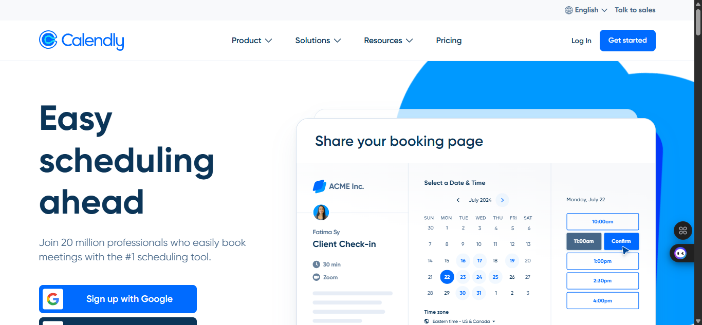
Source: Calendly
Calendly’s landing page gets straight to the point: scheduling without the back-and-forth emails. It’s clean, relatable, and easy to act on.
What’s awesome about this landing page design:
- Clear headline: “Easy scheduling ahead.” Instantly relatable.
- Simple sign-up: Quick and painless form design.
- Social proof: Testimonials reassure visitors they’ll save time.
Lyft: Service Landing Page Design
Lyft’s driver recruitment landing page is built to reduce friction. With a clean design and simple copy “Make every day payday”, it makes signing up as a driver feel fast, safe, and easy.
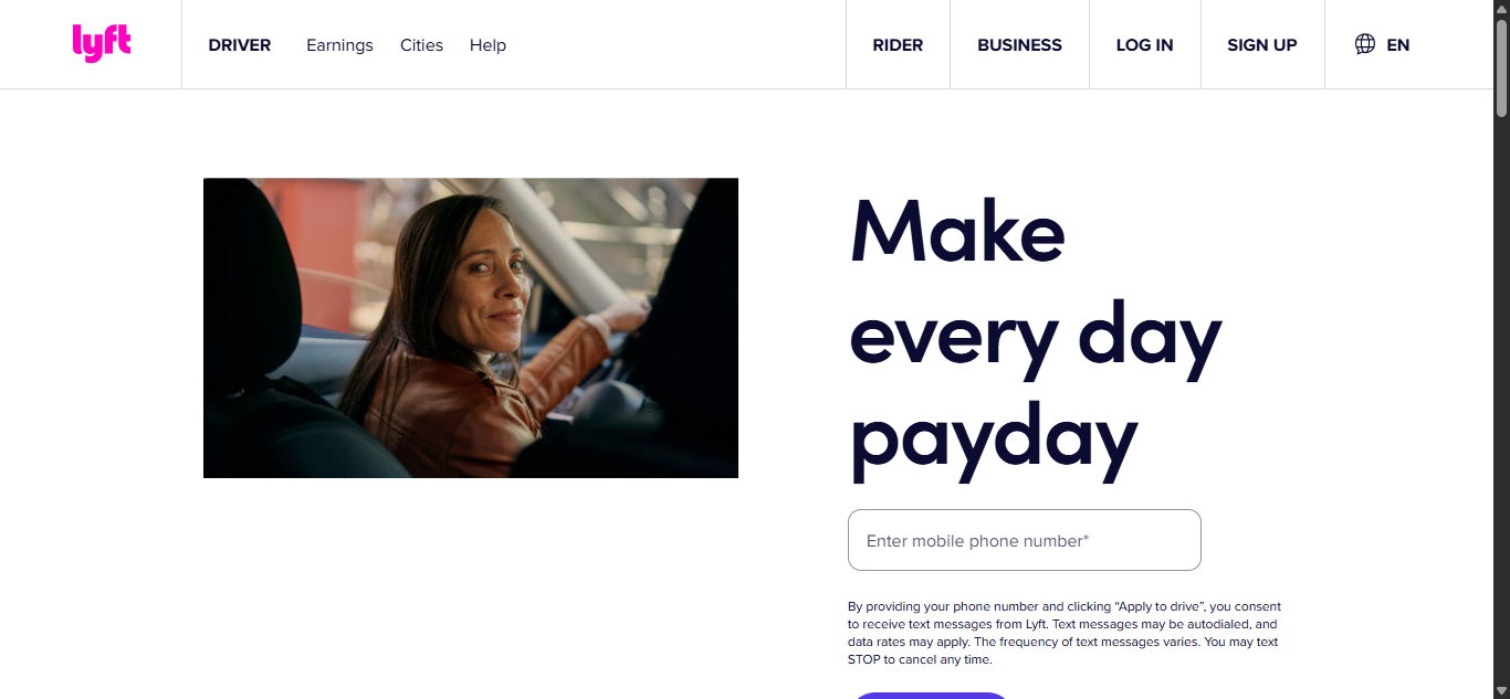
Source: Lyft
What’s awesome about this landing page design:
- Streamlined sign-up: The form is short and easy to complete.
- Focus on benefits: Highlights earnings potential and flexibility.
- Trust signals: Mentions of background checks and safety features reassure applicants.
WeWork: Service Landing Page Design
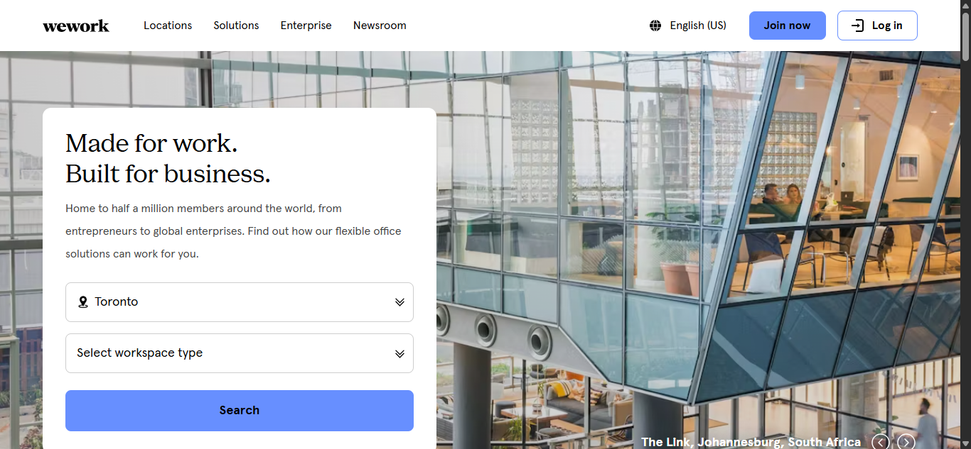
Source: Wework
WeWork’s “Book a Tour” landing pages are tailored for businesses looking for flexible office space. With big, bold imagery of their locations and a simple action path, the design makes it easy to explore their offerings.
What’s awesome about this landing page design:
- Strong visuals: Professional photos of workspaces make the offering feel premium.
- Focused CTA: “Book a Tour” is direct and service-specific.
- Transparency: Clear information about pricing, amenities, and membership perks.
What to Know About Landing Page Types for Brands
I don’t know if you noticed it yet, but you can see that there were differences in the landing page design examples above. Now, there’s a reason for that, and I will explain. As a brand, there are different messages you want to pass across based on what it is you offer and your user needs.
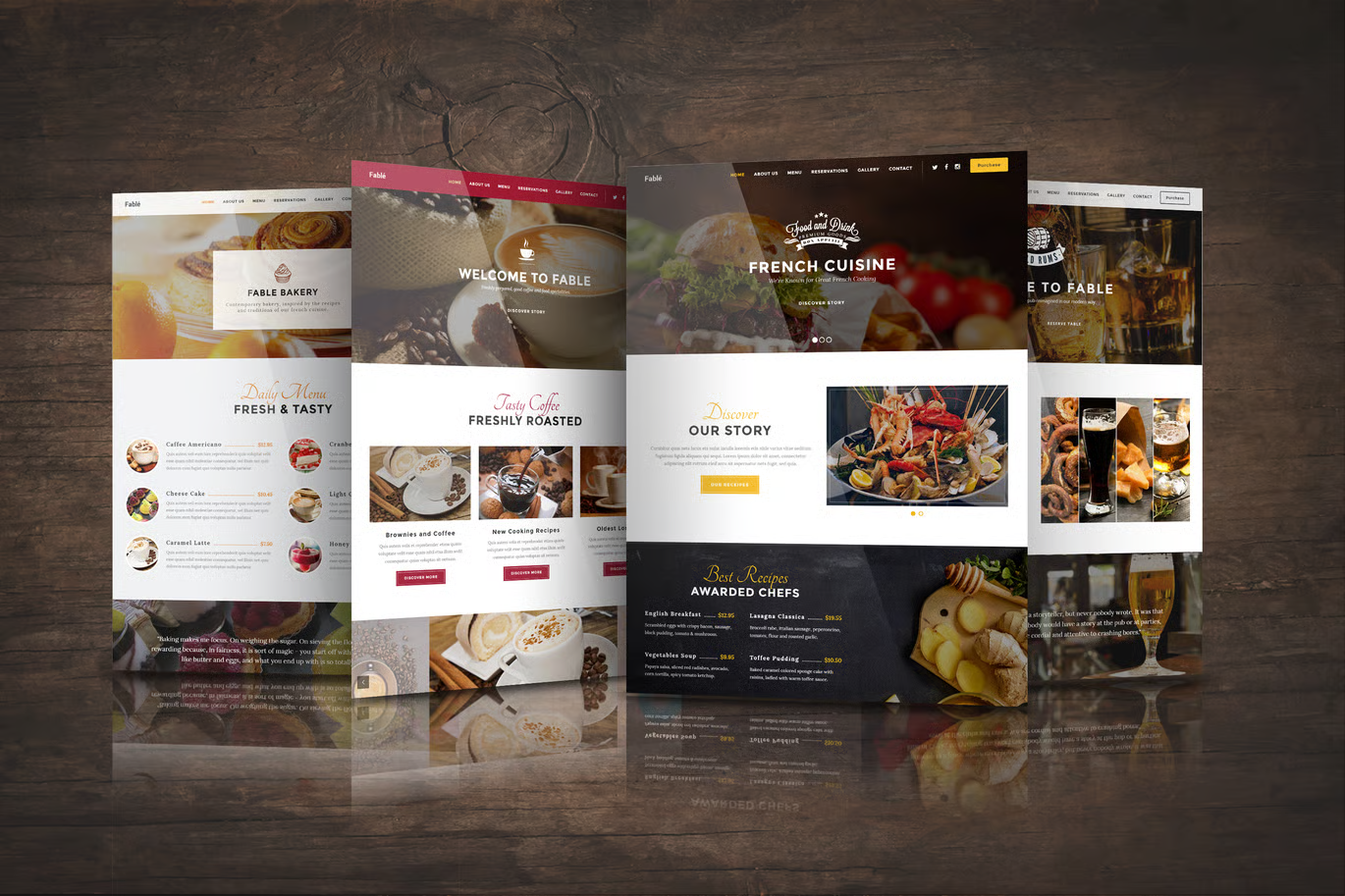
Service Landing Page Design Case Studies with Real Metrics
Law firms, marketing agencies, or home repair services are service-based businesses because they get paid for their services. For businesses like that, a simple, trust-building page would work better. Features of effective service landing page design include:
- Prominent contact forms or phone numbers
- Client testimonials and reviews
- Service guarantees or certifications
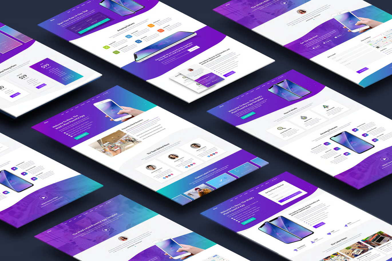
Product & SaaS Landing Page Designs & What Makes Them Good
On the other hand, product and SaaS companies thrive on storytelling. Their pages are built to guide visitors from curiosity to conversion:
- A problem-solution framework
- Screenshots or demo videos
- Tiered pricing tables
- Strong CTAs (“Start Free Trial,” “Book a Demo”)
Looking for the best way to reach your audience through a creative web landing page design that just speaks to them? Roareye has got you covered.
While trends come and go, there are timeless design principles every marketer should follow. Think of these as the foundation that supports everything else. Check out these best pratcices for landing page designs before your next project.
Best Practices for Landing Page Design You Must Follow
Layout Patterns, Typography, Use of Visuals & CTAs
Proven best practices for landing page design include:
- F-pattern or Z-pattern layouts: guide the reader’s eye
- High-contrast CTAs: ensure they stand out
- Typography hierarchy: headlines large and bold, supporting text smaller
- Strategic visuals: images should clarify, not distract
Accessibility, Mobile Responsiveness, and Performance Optimization
Next, let’s talk inclusivity. This is that part where your audience feels like you actually care. A beautiful design isn’t complete if it excludes part of your audience;
- Ensure color contrast meets WCAG standards.
- Add alt text for all visuals.
- Test screen reader compatibility.
- Design bilingual (English/French) pages for Canadian audiences.
Most people access websites right from their phones, making mobile users a large number of your landing page traffic. So, responsiveness is a must to keep users engaged on all devices.
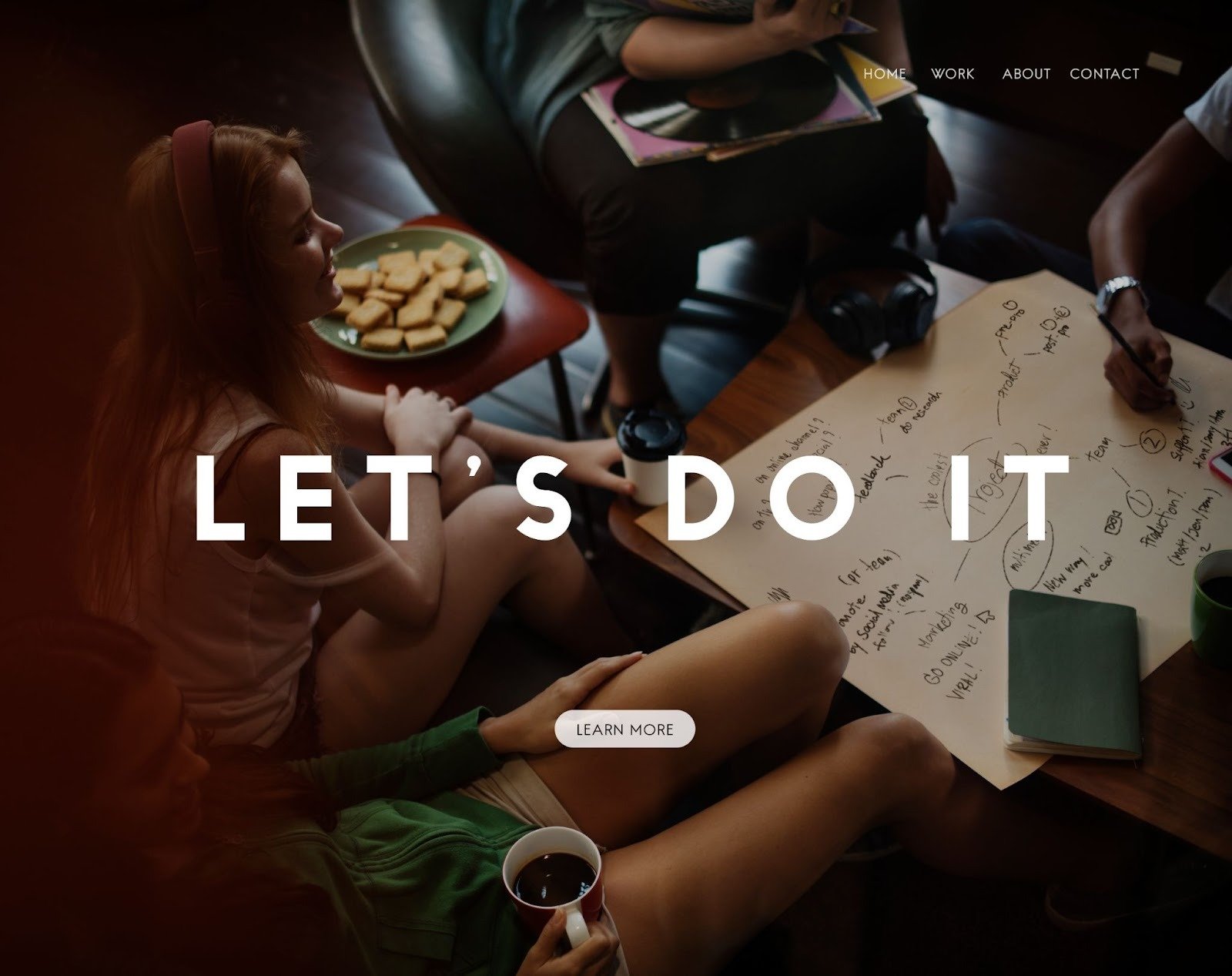
Creative Landing Page Designs That Inspire
If the previous section was about fundamentals, this one is about flair. Creative landing page designs are so cool, they make a lasting impression and keep your brand top of mind.
Cool Design Trends: Micro-animations, Dark Mode, Personalized Elements
In 2025, subtle interaction is king. Micro-animations create delight when users hover or scroll. Dark mode adds sophistication while reducing eye strain. Personalized elements like dynamic CTAs based on user location also increase user engagement.
Minimalist vs Bold Styles: Choosing What Fits Your Brand
Not all creative pages need to be loud. Minimalist landing page design focuses on whitespace and simplicity, often used by luxury or tech brands. In contrast, bold landing pages use oversized fonts, vibrant colors, and immersive visuals. The best choice depends on your brand personality and your audience’s preferences.
At Roareye, we don’t just help your brands choose the right style; we push boundaries with interactive, personalized touches that keep visitors engaged longer.
How to Build Your Own High-Converting Landing Page
Now that we’ve seen what’s working in the market, let’s see how you can actually create one. How do you go from having just an idea of a landing page design to creating a fully functional, conversion-focused landing page?
From Planning to Publishing: Workflow, Test, Iterate
Building a great landing page isn’t a one-and-done process. Follow this workflow:
- Define your goal (sales, signups, leads)
- Outline your structure (hero → proof → benefits → CTA)
- Design for mobile-first
- Launch and test (A/B headlines, CTAs, layouts)
- Measure results and refine
Testing is crucial. Tools like Google Optimize, Hotjar, and VWO can help you analyze user behavior and optimize designs continuously.
Checklist: What Every Good Landing Page Design Needs
To make sure you don’t miss the essentials, here’s a quick checklist:
- Clear value proposition above the fold
- Single, focused CTA
- Social proof (reviews, testimonials, client logos)
- Trust signals (certifications, security badges)
- Mobile optimization
- Fast loading speed
- Accessibility compliance
Conclusion
The best landing page designs in 2025 balance creativity, clarity, performance and usability. By studying landing page design examples, following best practices for landing page design and embracing new design trends, you can create a landing page that doesn’t just look good but also converts.
Before publishing, run through the checklist above. A good landing page design doesn’t just showcase your brand; it builds trust, solves problems, and inspires action.
At Roareye, we’re all about building brand futures. From web design and SEO to digital strategy and creative storytelling, we help ambitious brands stay ahead of the curve. Ready to design a landing page that’s beautiful, bold, and built to convert?
Frequently Asked Questions (FAQs)
1. What makes a landing page design effective?
An effective landing page has a clear value proposition, one focused CTA, fast load speeds, and a design that builds trust. Simplicity and clarity are key.
2. How many CTAs should a landing page have?
The best landing pages focus on one primary CTA. Too many choices overwhelm users and reduce conversions.
3. Are minimal landing pages better than detailed ones?
It depends on your audience. Minimal pages work well for simple offers, while detailed ones are better for complex products or services that need more explanation.
4. What are the top trends in landing page design for 2025?
Personalization, micro-animations, dark mode, and AI-powered content adjustments are trending in 2025.
5. Should landing pages be designed differently for mobile?
Yes—over 60% of users browse on mobile. Mobile-first design ensures that CTAs, headlines, and forms work seamlessly on smaller screens.