Landing Page Examples to Inspire Your Next Campaign
When it comes to digital marketing, sometimes the best way to learn is by looking at landing page examples that already work. These aren’t just “pretty” designs but pages that have been tested to turn visitors into leads and customers.
At Roareye, we believe that every business needs a landing page strategy that ensures a visually pleasing design and effective conversion method. The goal of your marketing, be it in form of ads, email newsletters, social media campaigns, is to bring in quality leads and convert them. So, of course, you will need a landing page that converts.
Below, we’ll walk you through some of the most effective landing page examples across industries, break down why they work, and show you how you can apply them to your own campaigns. Before that, let’s answer some questions you may have.
What is a Landing Page
If you are new to the digital marketing world, you may be asking, “What is a landing page?” To answer that in simple terms, a landing page is a standalone page that your new customers land on when you want them to take an action. When you want to create a specific marketing campaign, think of a landing page that converts. And no, it is not your homepage.
Homepage vs. Landing Page: Know The Difference
The comparison between “homepage vs. landing page” has been ongoing for a long time, but it’s time you get it right. A homepage is the very first page of a website. It provides an overview of the website, and you can also navigate the entire website right from there.
Meanwhile, a landing page is a one-page website created for a specific goal, such as collecting leads or promoting an offer. It helps to increase conversion rates and improve results. Understanding these differences can help you enhance your website’s performance.
What Makes a Good Landing Page?
Before we go into checking out some landing page examples, let’s actually see what makes a good landing page and how you can get yourself a landing page that convert
- A bold headline: Instantly communicates value.
- One clear goal: No distractions, just one offer.
- Persuasive visuals: Product shots, explainer videos, or clean layouts.
- Trust signals: Testimonials, reviews, and case studies.
- A strong call-to-action: Direct and action-driven
Mistakes to Avoid When Creating Your Landing Page
- Asking for too much info too soon.
- Weak CTAs like “Submit”.
- Overloading the page with text with little white spacing
At Roareye, we help our clients create landing page websites that is focused, goal-driven, and optimized for the visitor’s journey. Looking for a landing page that turns your prospects into customers? Roareye is your go-to.
High Converting Landing Page Examples
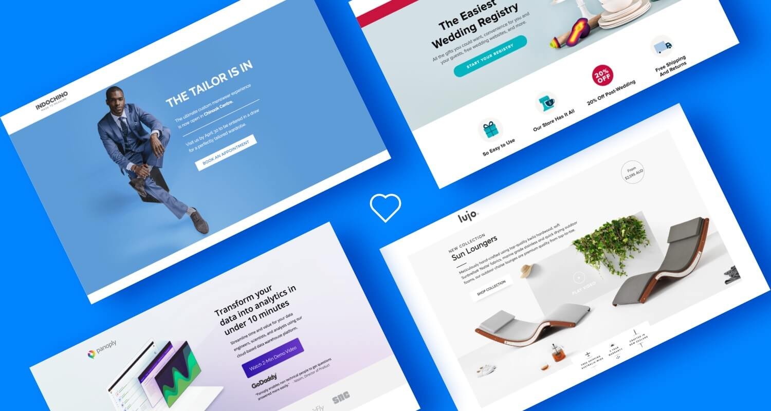
Shopify Plus
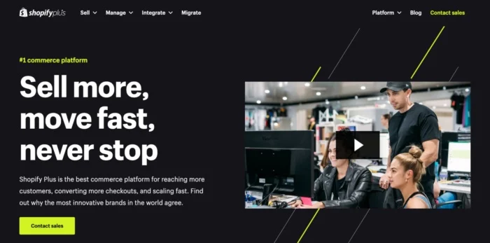
Shopify Plus understands its target audience to be enterprise e-commerce brands. Rather than offering a free trial, they use the call-to-action (CTA) “Contact Sales,” which is a more appropriate strategy for companies facing large and complex decisions. The page also supports its claims with reliable data, including performance statistics from actual clients.
Tip: It’s essential to align your CTA with the stage of the buying journey your audience is in.
Slack
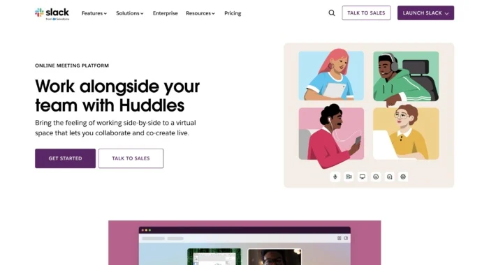
Slack’s landing page for “Huddles” uses looping videos to show real-time collaboration in action. You don’t just read about the feature, you see exactly what it can do. This instantly builds clarity and trust.
Tip: If your product is visual, let visitors experience it right away.
B2B Landing Page Examples
HubSpot
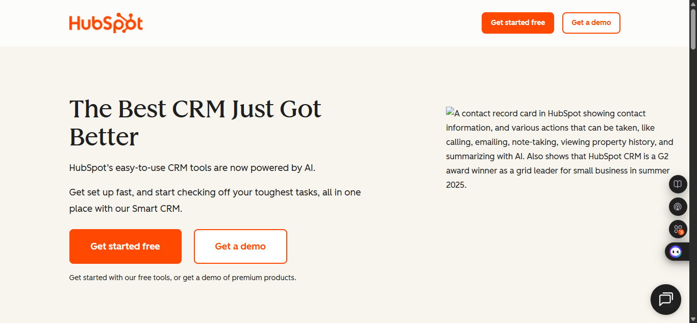
HubSpot’s CRM landing page leads with the words: “The Best Just Got Better” It’s clear, compelling, and exactly what users are looking for. Below that, they showcase features and use testimonials to ease doubts.
Tip: State your value fast, then back it with proof.
Clio
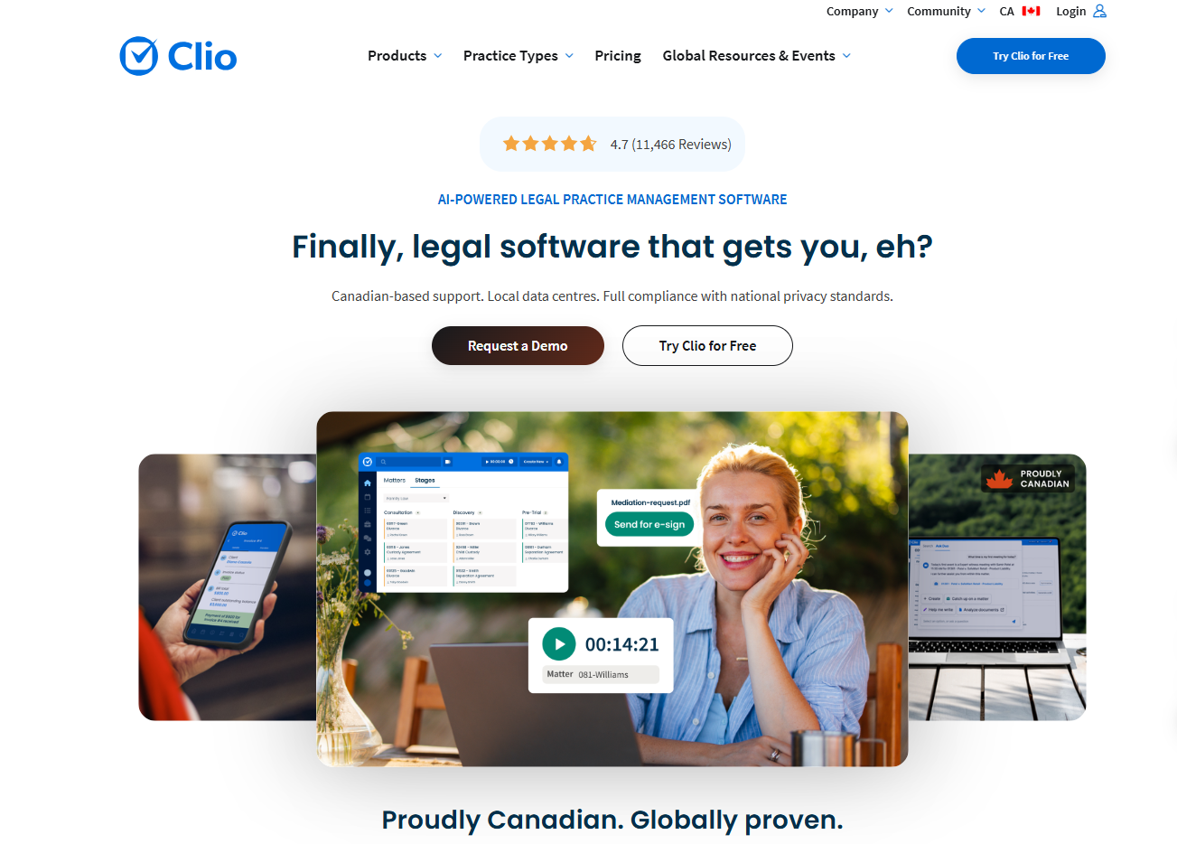
Toronto-based Clio targets law firms with a landing page focused on saving time. They highlight pain points like administrative overload, then present a free trial as the solution.
Great B2B landing pages speak to ROI and pain points directly.
At Roareye, we often create B2B landing pages with similar strategies which focuses on pain points, value, and measurable outcomes. Want a B2B landing page that just gets your audience?
Product Landing Page Examples
Knix
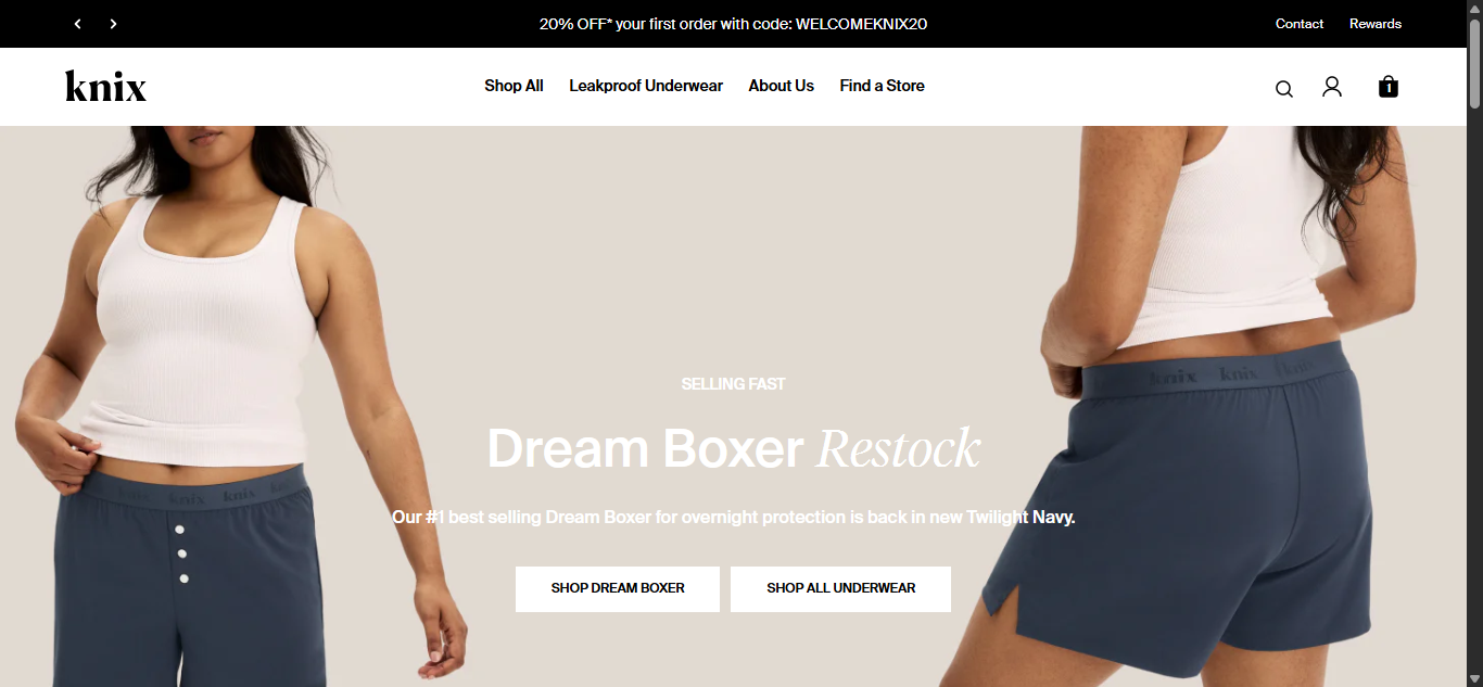
Canadian brand Knix keeps their product landing pages clean and trust-driven. You’ll see strong visuals, real customer reviews, and bold CTAs like “Shop Now.” Nothing extra, nothing confusing.
Tip: For ecommerce businesses, let visuals and social proof do the heavy lifting.
Webflow
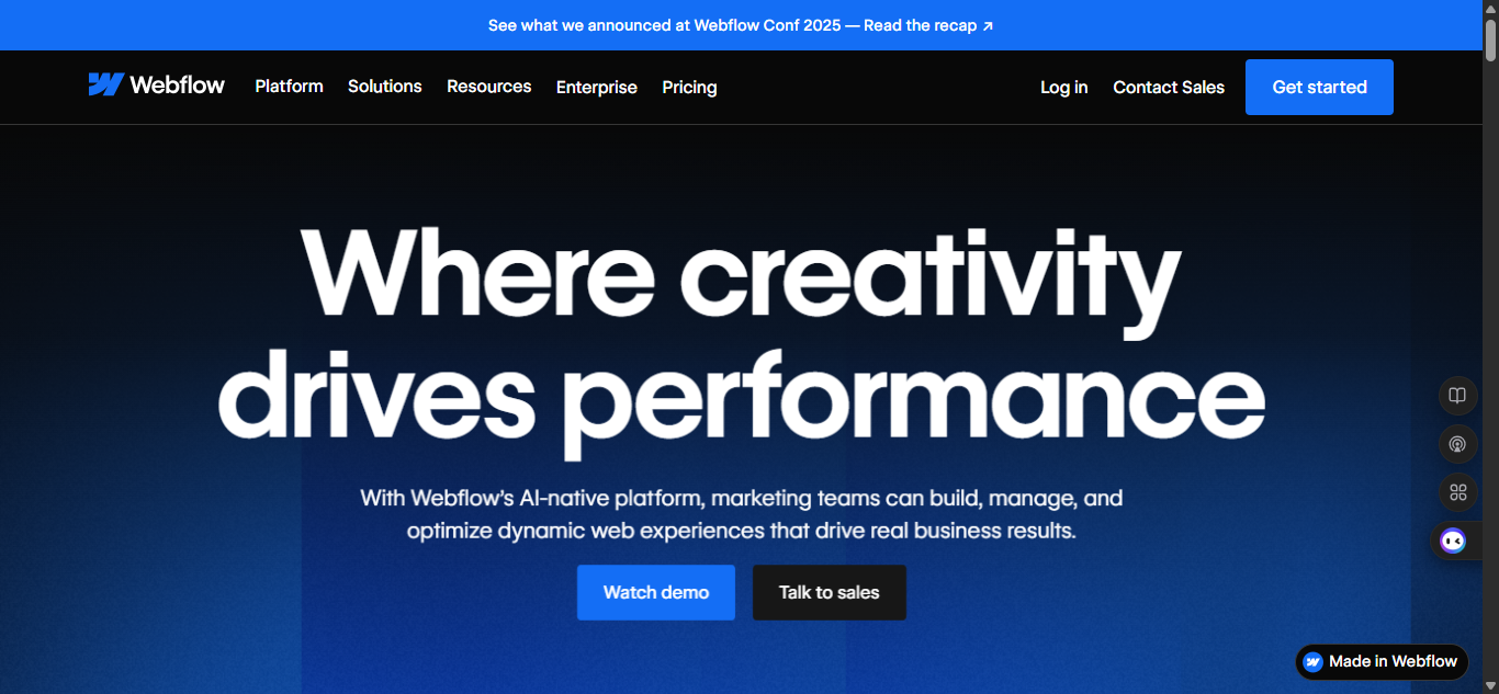
Webflow speaks directly to non-coding designers. Their product landing page doesn’t just explain features, but it also shows the kinds of websites you can build using Webflow. The visuals do the selling, and the CTA calls you to talk to sales
Tip: Show, don’t just tell. Demos and visuals can convert better than words.
Lead Generation Landing Page Examples
Mailchimp
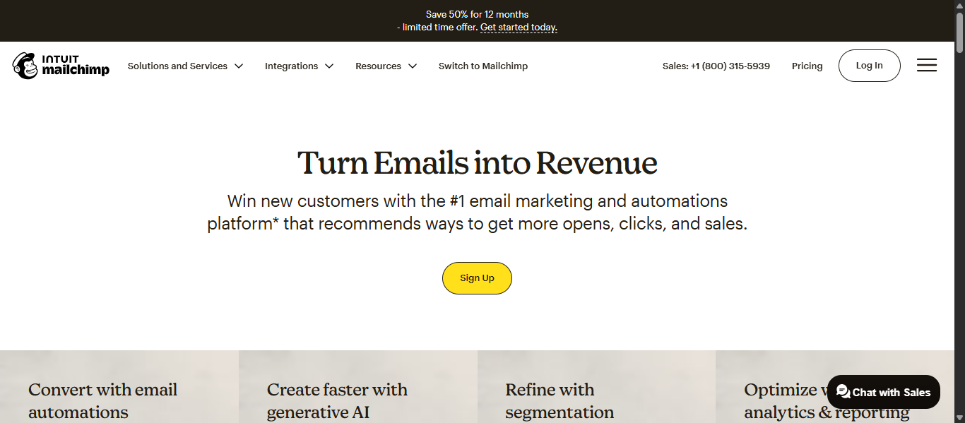
Mailchimp’s newsletter landing page has one job which is to collect emails. It’s just a headline, short copy, and an email box. No distractions. Very simple and straight to the point.
Tip: For lead generation, simplicity wins.
Unbounce
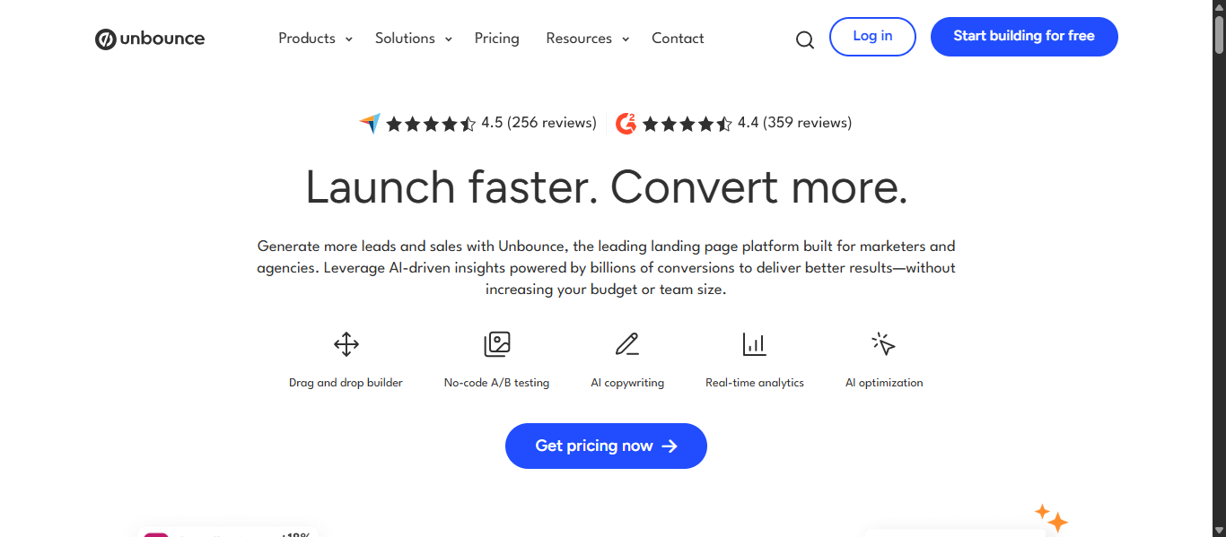
Unbounce shows off pre-built landing page templates with screenshots, testimonials, and proof of performance. The value is clear before you even sign up.
Tip: Sell the benefit first (higher conversions), then the product (templates).
At Roareye, we often recommend this two-step approach for lead generation: highlight the outcome, then showcase the tool or service. Thinking of getting started with your campaign journey?
Simple Landing Page Examples That Convert
Dropbox
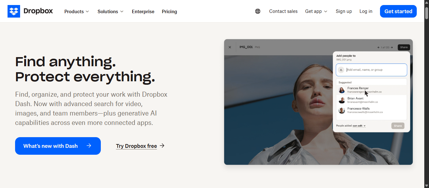
Dropbox landing page is simple and straight to the point. A headline, A small body text, an animated video that explains how to use. There’s also the CTA telling you to “Try Dropbox free”.
Ti: If your offer is strong, you don’t need to do too much with design; keep it minimal and clean
Basecamp
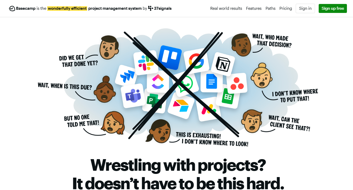
Basecamp uses plain, relatable copy: “Wrestling with Projects?. It doesn’t have to be this hard.” Add a clear CTA and social proof, and they’re done.
Tip: Speak like a human, not a marketer.Think of your audience’s pain point and show you understand and have a solution.
Conclusion:
Looking at these landing page examples shows us one thing: there’s no single “right” way to build a landing page. The best pages are the ones that put the visitor first, speak directly to their needs, and guide them toward one clear action.
At Roareye, we specialize in turning inspiration into execution. Whether you’re launching a new SaaS product, running a Canadian ecommerce campaign, or building B2B lead generation funnels, we design landing pages that convert and are visually pleasing as well.
Ready to build a landing page that gets results?
Frequently Asked Questions About Landing Page Examples
What is a landing page?
A landing page is a standalone web page designed to convert visitors into leads or customers. Unlike a homepage, it focuses on one specific offer.
What makes a landing page effective?
The essentials are: a clear headline, concise copy, trust signals, one focused CTA, and a design optimized for mobile.
What’s the difference between a homepage and a landing page?
- Homepage: A broad overview with multiple links.
- Landing page: One campaign, one goal, no distractions.
Do simple landing pages really work?
Yes! Some of the highest-converting landing pages, like Dropbox’s, are very simple. Less friction often means more conversions.
Do I need different landing pages for different campaigns?
Ideally, yes. Each campaign should have its own dedicated landing page for better message alignment and higher conversion rates.